A Website Redesign
The First Steps to Improving the UX on a SaaS Product
PROJECT OVERVIEW
The Problem
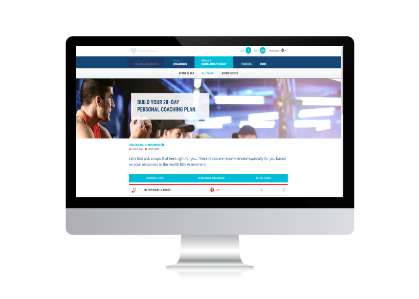
The Digital Health Coach is a feature of a SaaS product that is meant to encourage user participation in self-managed healthy activities. However, after conducting user surveys, we learned that users are having problems understanding how to use this feature.
The Solution
To redesign the feature so that users are guided through the process of creating action plans.
The Tools
Excel, OBS Studio, pencil and paper, and Adobe XD
My Role
UX Researcher and UX Designer
The Team
The Product Manager, Content Manager, and UI Designer
UX RESEARCH
User Surveys
Before I became part of the team, user surveys were sent out to everyone who accessed the Digital Health Coach after logging in. The survey was available for one year and was designed as a multiple choice survey based on the Likert scale.
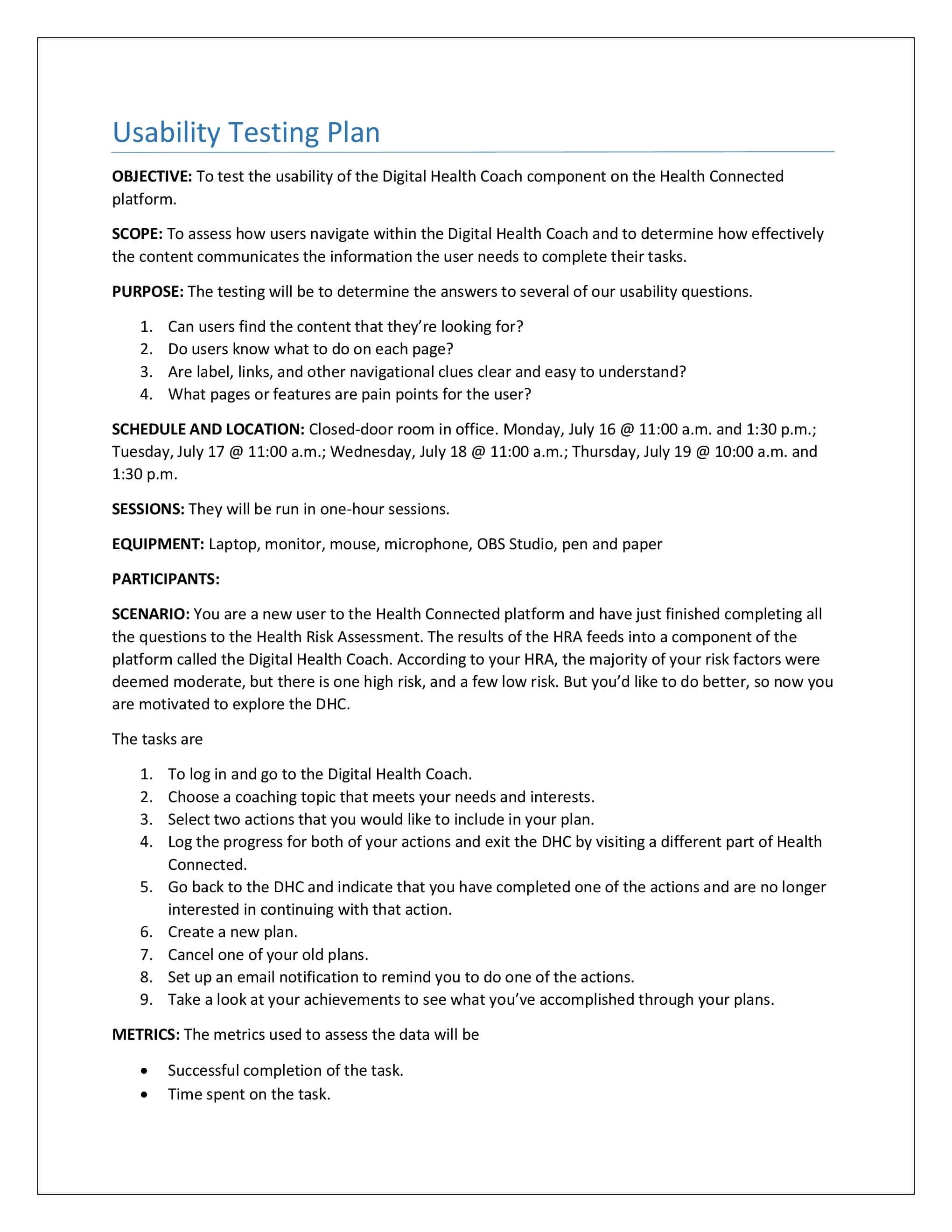
I joined the team just in time to analyze the survey results. After reviewing these results, I began organizing a series of usability tests. Knowing that survey answers are based on the users’ awareness of the situation, I wanted to see how potential users would respond in a more immediate setting.
Usability Testing
Unfortunately, we didn’t have direct access to our users. The next best scenario was recruiting internally. I needed to find at least 5 participants who had no involvement in the development of the product. I thought that this would be difficult given the size of the company, but I managed to find 5 people who had no prior contact with the product.
I drafted a plan that featured tasks that I wanted the participants to complete. I also wrote a script to help make sure I was giving the same direction to everyone (and to make sure I wasn’t forgetting anything). Then I reserved an office and scheduled time with each of the participants over a period of 4 days. I also recruited people on my team to act as an observer while I led each session.
Key Insights
Even though there are instructions on the page, guiding users on what to do, very few people are reading these sections.
There are a lot of actions that users can perform on each page which causes users to overlook features that might be useful to them.
Users are frustrated with the multiple layers of navigation and clicks needed to accomplish tasks.
Personas
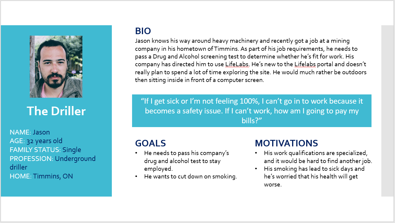
Without access to actual users, I had to be creative in finding information on possible users. For this, the team participated in several information-gathering meetings with the product owner and other stakeholders.
We were told that the product would be used by employers whose goals included cutting down on employee absenteeism through improved health.
To achieve this, they wanted to use the Digital Health Coach to encourage a healthier, more active lifestyle among their employees. I was instructed to use an example of a natural resource company.
I researched various companies in this industry in Canada and looked up job postings to see what kind of roles these employees might have. Then I searched for information on who a typical user might be for a health and wellness application. I combined what I learned to come up with several possible personas.
DESIGN
Sketching
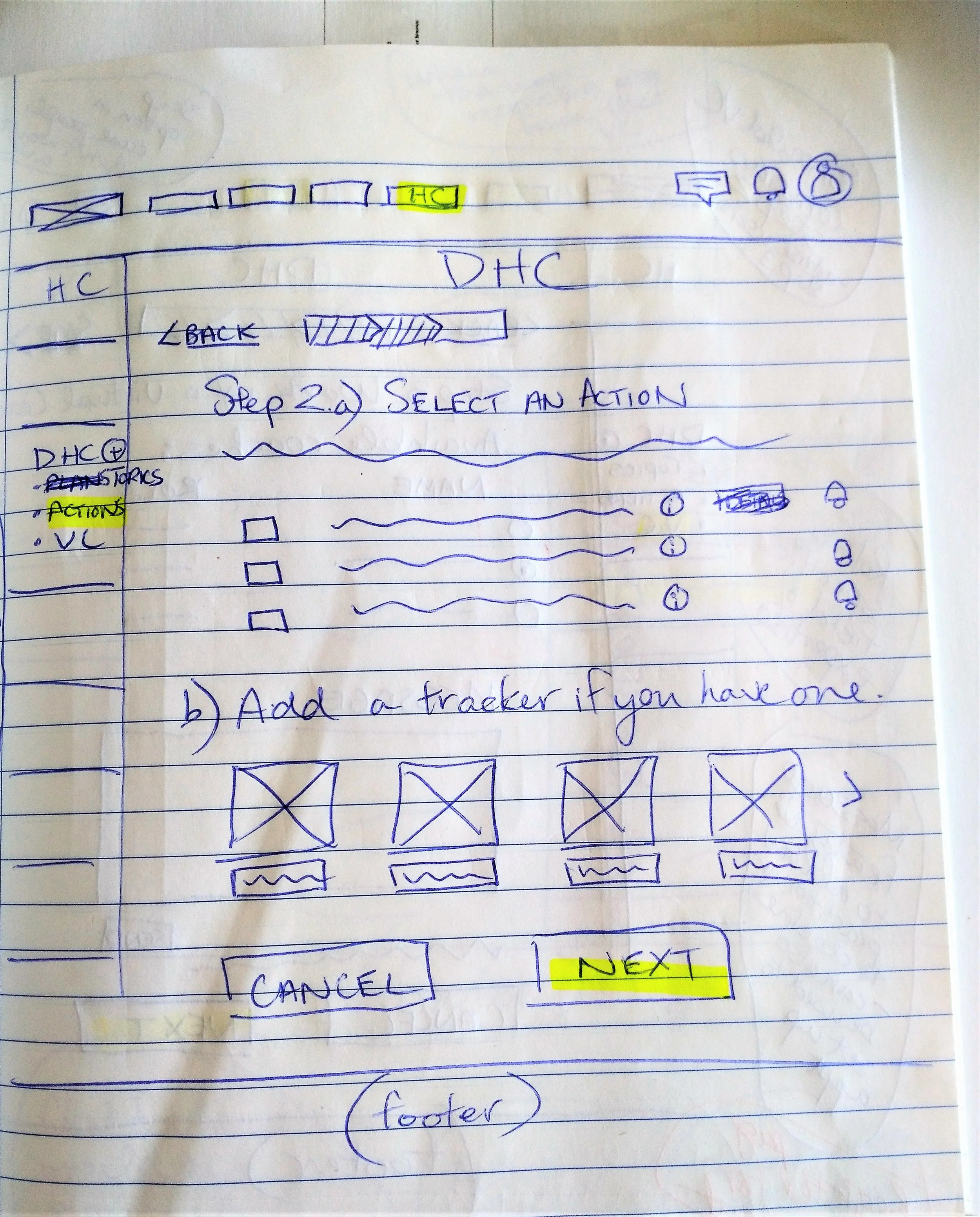
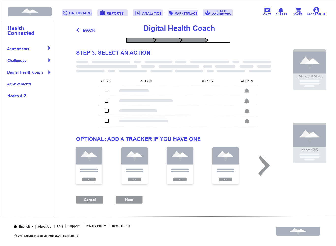
After discussing the insights and personas with the team, I started sketching some ideas on paper. My aim was to make navigation clearer by including a progress bar, limiting the amount of copy so that key instructions stand out, and including call-to-action buttons to keep users moving towards their goal.
I presented my rough sketches to the team and received some feedback, which I incorporated into the next iteration of sketches. Due to time constraints, once I completed my sketches, I had to move on to wireframing.
Wireframing
The team was working toward a tight deadline to present our ideas to the product owner. I created a series of responsive wireframes for the website, which I presented to a small group that included members of the Development team.
After some additional tweaking based on comments given by the group, we moved on to the UI portion of the project.
FINAL OUTCOME
After creating mock-ups that we presented to the stakeholders, we are now awaiting feedback. Hopefully, I’ll have an update on this soon!
KEY TAKEAWAYS
One of the things I wish could’ve been possible was to have access to real users. It’s difficult to tell whether this product redesign will really work without actually testing it on the people who use this product. Because we don’t deal directly with users of this product, there’s a layer of distance that makes it difficult to really assess designs. So far, we’ve relied on UX best practices to guide our thinking.
However, now that there’s a bit of time while the stakeholders make their decisions, my plan is to organize prototyple testing if we get the go-ahead with this design. Fingers crossed!
