The Member Centre MVP
Navigating the UX design challenges of working on an MVP
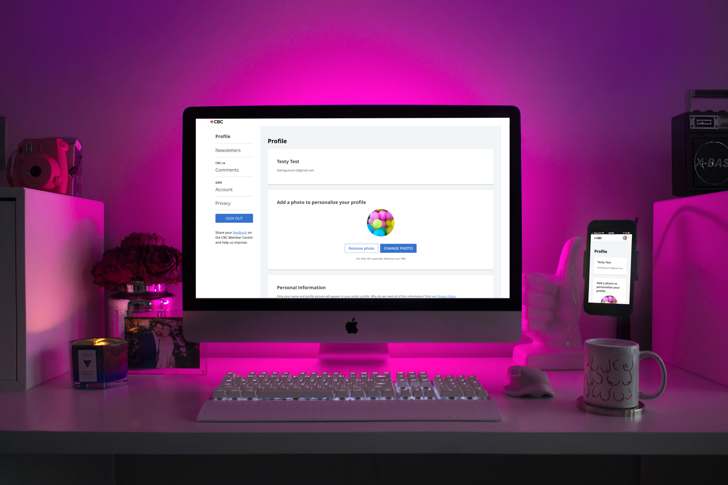
Photo by DESIGNECOLOGIST on Unsplash
PROJECT OVERVIEW
The Problem
For the MVP, the requirements for the member centre redesign were constantly shifting. The existing member centre had limited functionality, was difficult for users to access, and contained content that was of little use to the user. Given the tight deadline, we needed to find a way to make UX improvements while accommodating stakeholders and business needs that were being defined.
The Solution
Design an MVP based on a future state that could be scaled down as needed while requirements were being refined.
The Tools
Airtable, paper, pencil, Abstract, Sketch, and Google Slides
My Role
UX Researcher and UX Designer
The Team
The Product Manager, Agile Team Lead, 4 Developers, and UI Designer
UX RESEARCH
Comparative Analysis
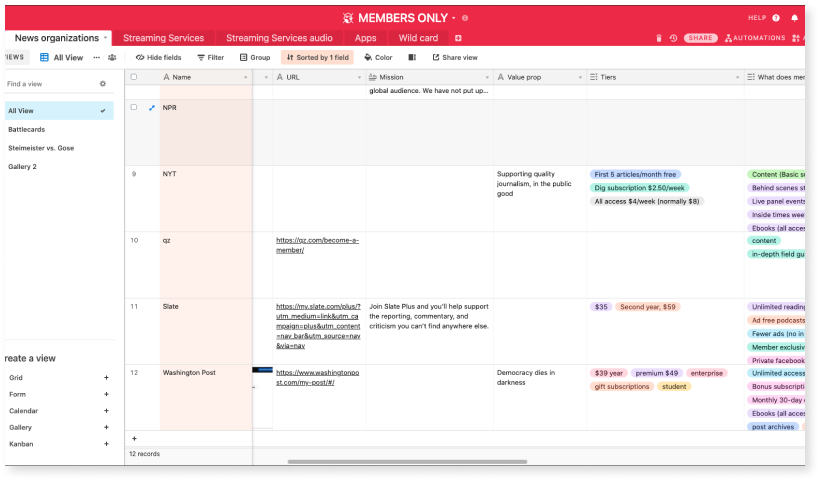
Comparative analysis of membership experiences using Airtable.
As part of the larger task to understand membership’s potential, I partnered with other members of the UX team to undertake a comparative analysis of membership across different industries and platforms. The goal was to understand what was being offered to members and how that experience was being delivered.
Key Insights
Patterns emerged among all the organizations and companies that pointed to 5 different membership models.
The main purpose of the member centres seemed to be to address users’ problems as quickly and efficiently as possible.
User Flows
After studying different types of member centres, we decided to map out an ideal user flow that would accommodate future state.
We created several iterations as the possibilities of new features were being discussed.
The user flow diagram helped to give us an understanding of what the information architecture could look like for a future member centre.
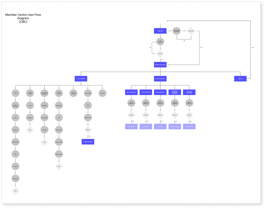
An early draft of the user flow.
DESIGN
Sketches
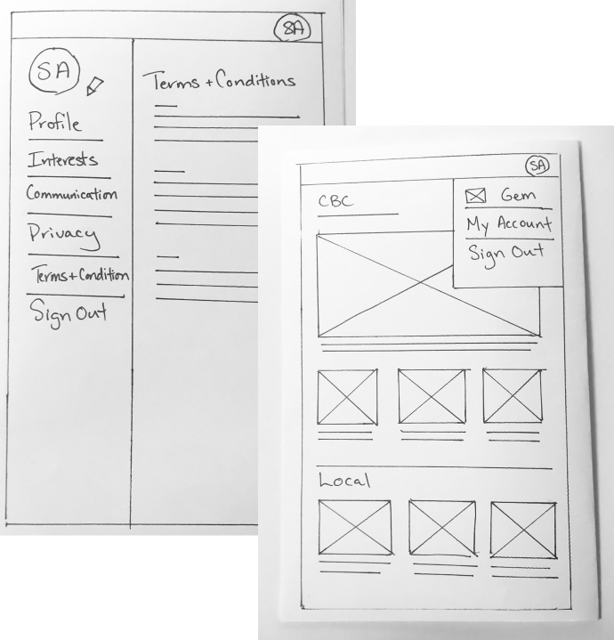
Early sketches
Now that we had an idea of what the user flow might look like, we started sketching out possible designs.
We began organizing the features and discussing where they should live.
Based on continuous feedback from the team, we kept iterating until we had a good understanding of how the member centre could be structured.
Wireframes
We started wireframing based on the sketches and began weekly feedback sessions with the team to continuously refine the ideas and get input from the developers.
As we neared our deadline for MVP, our requirements became clearer and we had to pivot to focus purely on current functionality. We revised the wireframes and worked closely with the developers to understand what UX improvements we could make within our timeframe.
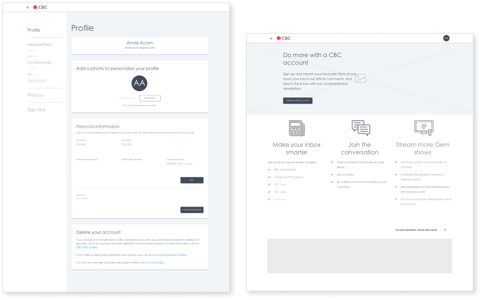
Mid- to high-fidelity wireframes.
MVP Design QA
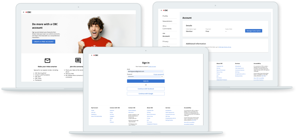
MVP for internal release.
The team decided that our MVP would be based on the wireframes since the UI was still being developed. Since the wireframes were high-fidelity, the developers were able to create a usable interface.
The team decided that it would be best to launch the product internally first. By doing so, it gave us an opportunity to test the member centre and gather feedback from our coworkers as well as do our own design QA.
We went through each of the steps from ideal use case to edge cases. We looked at the sign-up flow as well as the experience of accessing the available features in the member centre.
We were able to flag several bugs and discrepancies between the wireframes and the final product.
From the feedback, as a team, we prioritized the list of fixes based on the level of impact for the user.
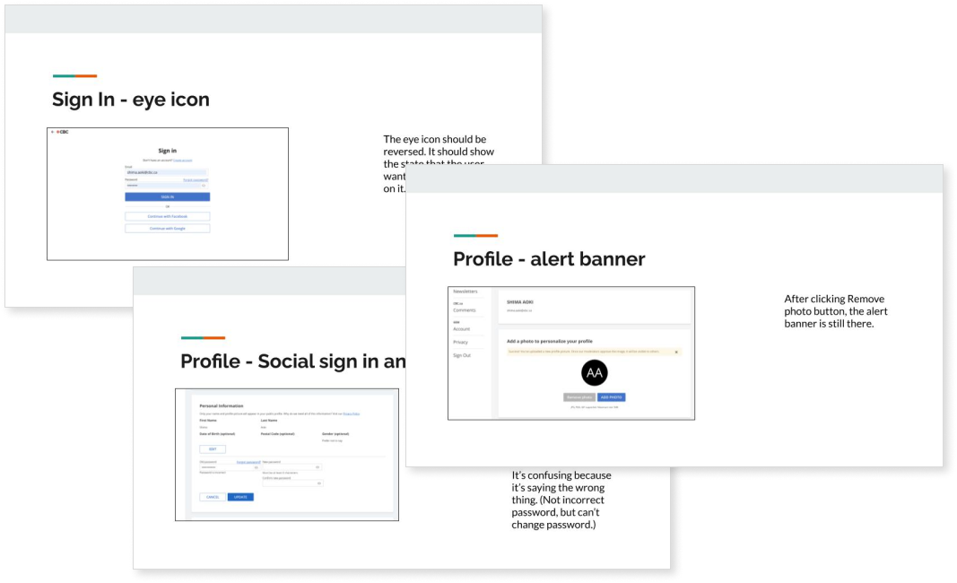
Design QA notes for feedback.
FINAL OUTCOME
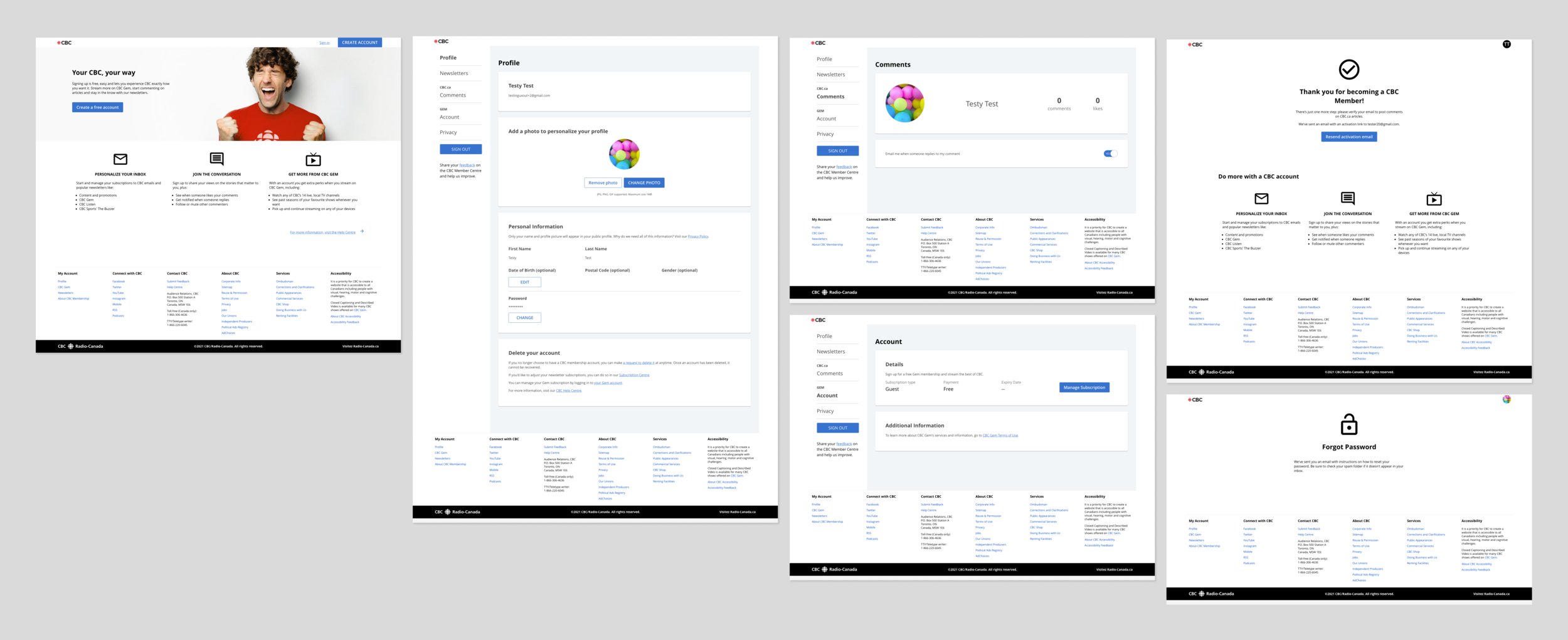
Member centre MVP experience
One of the main UX fixes our team was able to complete before launch was improving the UX writing and organization of the member centre. Although our main task was to migrate the current experience into the new codebase, we felt very strongly that one of the key improvements we could make was to add more effective messaging for error states and confirmation-style pages and make information as easy to locate as possible.
In the previous version, the error states were system-generated messages that didn’t provide our audience with a clear understanding of how to fix the problem or, in some cases, that an error had even occurred. The new error messages were designed so that people can identify the error quickly and correct it. We also added messaging that alerted people about changes in state as well as details on what was happening with the system.
We also added some content to help people find the information they’re looking for as easily as possible. This was in line with our initial understanding of member centres being places where people came to for help. So one thing we did was to add the information for account deletion into the Profile page. Although our users can’t automatically delete their accounts from this page, we added links that will send them directly to the information they’re looking for. In the previous experience, users had to search the whole site for this information and often had to dig around in the CBC Help Centre to get their answers. This was a major pain point for users who were already frustrated and now were forced to search hard for details on how to cancel their accounts.
NEXT STEPS
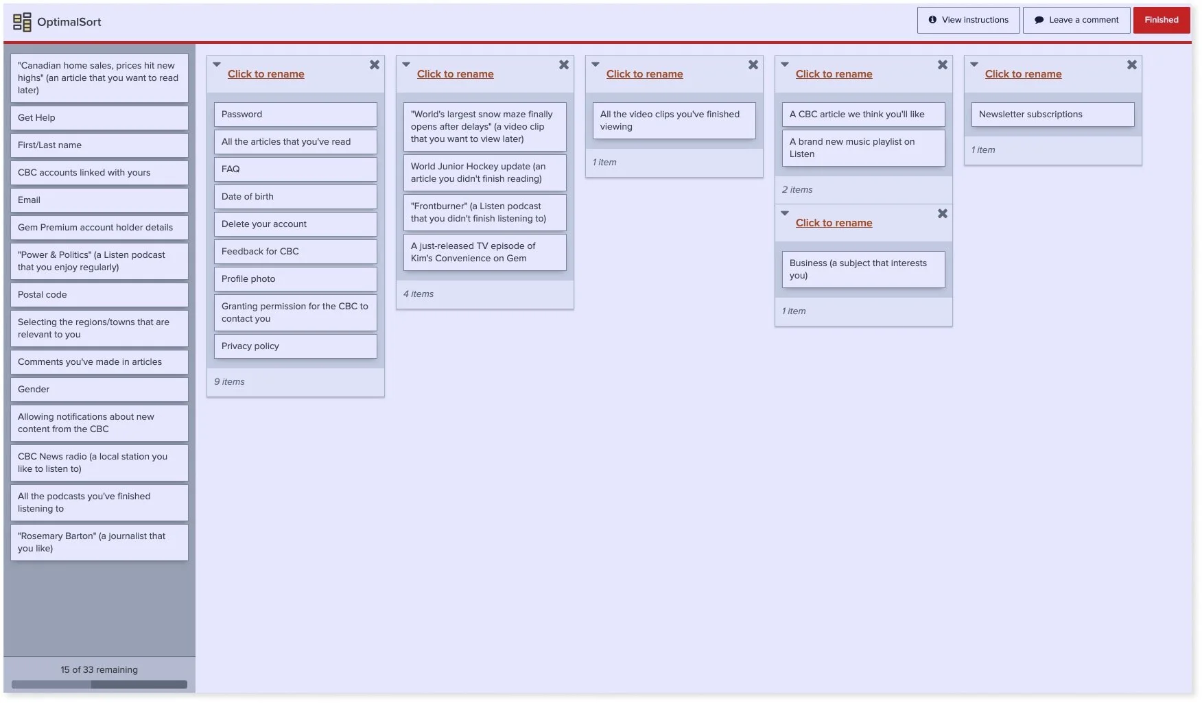
A draft of the proposed card sort.
With the launch of MVP, the next steps will be to collect feedback on the member centre experience. Our team included a feedback link for people to share their thoughts with us.
We also plan to conduct a card sort to understand if the connection betweeen the navigation menu and the content that exists on each page is clear to our users.
Lastly, we are working on prioritizing the work that should be included in the next phase of the member centre. This will likely include further research on audience acquisition.
KEY TAKEAWAYS
When working in an environment where requirements are unclear, it’s really important to try to stay as nimble as possible. One important aspect to this is to have regular open discussions with the team. As a designer, it’s particular crucial to have clear lines of communication with the developers to find out what elements of the design work for them and what doesn’t and why. Having that close collaboration is essential to helping the team meet its goals.
Upon reflection, one thing that I would do differently would be to reach out sooner to other teams whose work directly impacts the member centre. Due to the tight timing, we didn’t have a clear process in place for working with other teams. We had presentations and demos, but we could have gone deeper with our questions and feedback. As a result, we weren’t able to discover all the edge cases and had to schedule that work for post-MVP.